Fineliner detailed works:
In the early stages of my portfolio, I was confident using pencil and ink to create my urban landscape sketches. I discovered artworks that were solely composed using fine-liner, which also used techniques such as cross-hatching, thin and thick markings and dry pens to create tone and texture. This was after looking at the works of fine-liner artists like Taylor Mazer, Stephen Wiltshire and Julia.C.Schmitt. Initially, the notion of working in fine-liners and moving away from pencil and ink was intimidating; however, it was a logical evolution for my artwork. This led to my very first fine-liner drawing – a staircase and building in Camden:
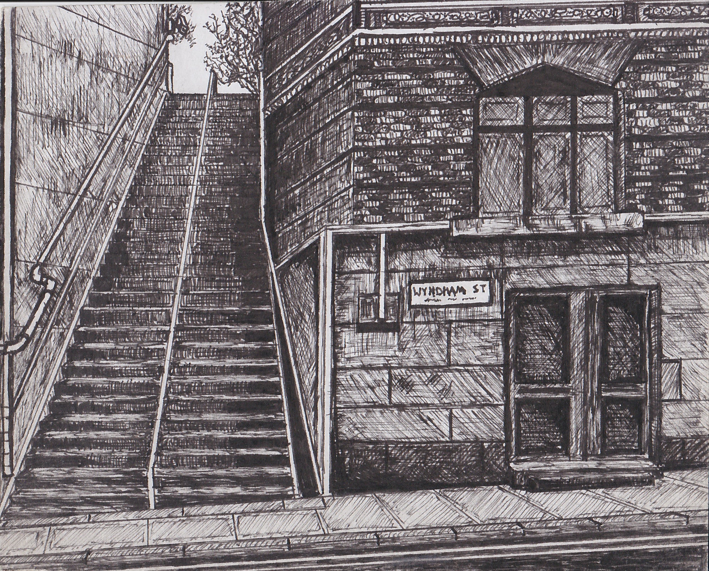
With this drawing, my intention was to create a realistic drawing of an everyday urban landscape that Londoners can recognise and appreciate. Fine-liners were the perfect choice of media to meet this intention because the fine nibs allow me to recreate details and the urban characteristics seen on a London street. For tone I used a thicker 0.05mm nib to create dense lines that give the appearance of a shadow. The composition of the artwork is mainly made out of items in foreground with little in the midground and background. This was done to give the drawing a sense of density that you frequently find in London streets. Despite this being my first fine-liner work, It holds great personal value and is one of my favourite works I have ever made.
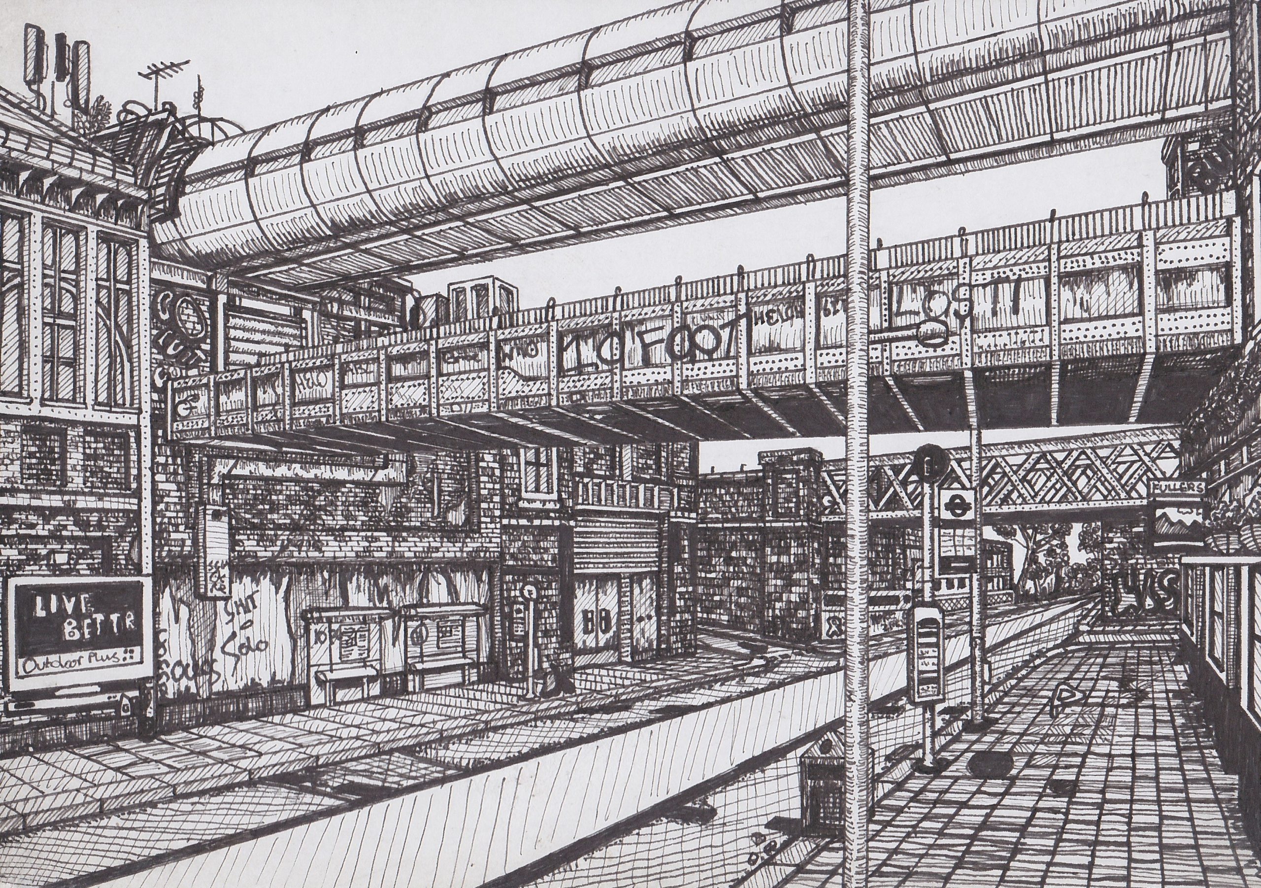
This drawing was created from a photo I took of Waterloo from the outside. The composition is composed of a street and pub in the foreground, the station and bridges in the midground and a third bridge in the background. This is the most recent fine-liner drawing and differs to my first attempt in several ways. The main difference being that more of an emphasis was placed on recreating a rough, worn brick texture that is seen all across the city as opposed to focusing on tone. This effect was achieved by using 0.03mm fine-liners to draw individual bricks. This was heavily inspired by the work of Urban Sketchers such as Taylor Mazer and Julia.C.Schmitt. This gave me much more control to choose different textures for each brick as opposed to simply texturing the whole wall. Overall, I am pleased with the final effect, the details came out as planned and the drawing met my intentions of making a highly detailed urban scene. My next steps, would be to refine the textures on the road as they did not come out how I wanted at all.